Gapmash
A fun, personality-based quiz that helps new users find groups and events they love.

Project Overview
Context: During a 3-week UX/UI internship, at a tech start-up called Gapmash, I worked alongside 2 other design interns led by the product owner of a newly launched mobile application.
Tools: Figma, Adobe XD, Miro, Zoom, Powerpoint, Excel
UX Methods: Personas, Empathy Maps, Affinity Diagramming, SWOT Analysis, Mindmapping, UX Walkthroughs, Sketching, Wireframing, Prototyping, Mockups

THe client
Gapmash is an innovative platform app based in Australia that helps students juggle their class schedules while keeping up with their social lives. It is a university social planner tool that connects students with friends and introduces them to exciting real-time events happening around campus.
The app was initially designed to target three core user needs:
1. Manage student timetables
2. Discover new events on campus
3. Make plans with friends
the problem
Gapmash’s mission is to be:
“The number one student eco-system that creates connection within the university community.”
However, despite conducting extensive marketing campaigns to promote their new, the Gapmash app had yet to gain traction among university students in Sydney, especially during the ongoing pandemic.
the SOLUTION
To breathe new life into the Gapmash mobile application, our design intern team of 3 collaboratively designed new user flows based on real user feedback. This included refining the existing UI such as buttons, icons and layouts and implementing new personalised features for users.
I personally took the reins on ideating and designing a new feature from scratch, a ‘Persona’ sorting quiz that would personally recommend student societies or events based on their preferred interests or hobbies.
Design team approach
Throughout the project, we followed a five-step design process:
Empathise > Define > Ideate > Iterate > Deliver.
We all contributed to each step, working together to present our final app redesigns to the client and stakeholders by the end of our 3-week internship.
Additionally, our team were also a part of the app’s target users as we were all founding members of a new student society together at our university. This meant we were able to better empathise with users, presenting unique solutions that enhanced the user experience for both university students AND student event organisers.
Step 1, Empathise.
looking at pREVIOUS RESEARCH
The Gapmash team had already gathered extensive user research data, including UX audits and new feature recommendations. The feedback made it clear: the app needed a UI redesign plus more engaging onboarding and promotional features to attract and retain more users.
To quickly get up to speed, we utilized identified user needs, empathy maps and personas provided by the Gapmash team, which helped us understand the app's diverse user base.


Step 2, Define.
Synthesizing User Feedback
We conducted affinity diagramming to group and analyze feedback from both students and event organizers. I found fundamental user needs or themes by grouping similar user quotes or remarks from previous app reviews and recommendations. This revealed key pain points in the current mobile app and website interfaces.

SWOT Analysis
Using SWOT analysis, we critiqued existing features and brainstormed potential improvements. This method helped us prioritize which features to tackle first, ensuring we focused on the most impactful changes.

Step 3, Ideate.
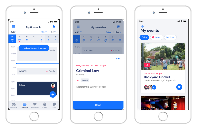
APP sign up flow
While reviewing the app I noticed how long and overwhelming the list of interests i had to scratch through during the sign-up process.

using gamification aS a feature
A childhood memory sparked an idea. I remembered a feature from the Nintendo game 'Pokemon Mystery Dungeon', where a personality quiz determines what kind of Pokémon you are.
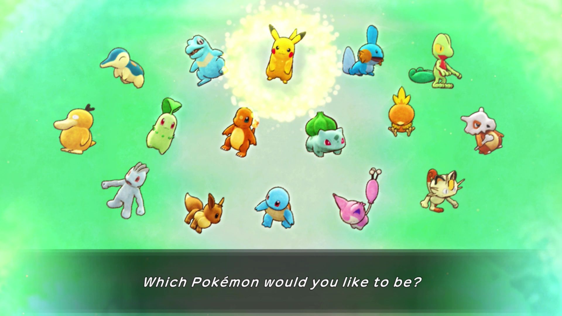


This inspired me to rethink Gapmash’s recommendation system into a similar kind of personality quiz that would be way more engaging and quicker for new users.
TASK PRIORITISATION MATRIX
After pitching my ideas in meetings, my personality test concept was chosen using a task priority matrix, scoring well as a High-impact solution for boosting user engagement.

MAPPING OUT USER INTERESTS
I started by screenshotting all the interest tags from the app sign up screen and mapping them all inside a Venn-like diamond, creating 'quiz questions' next to similar tags.
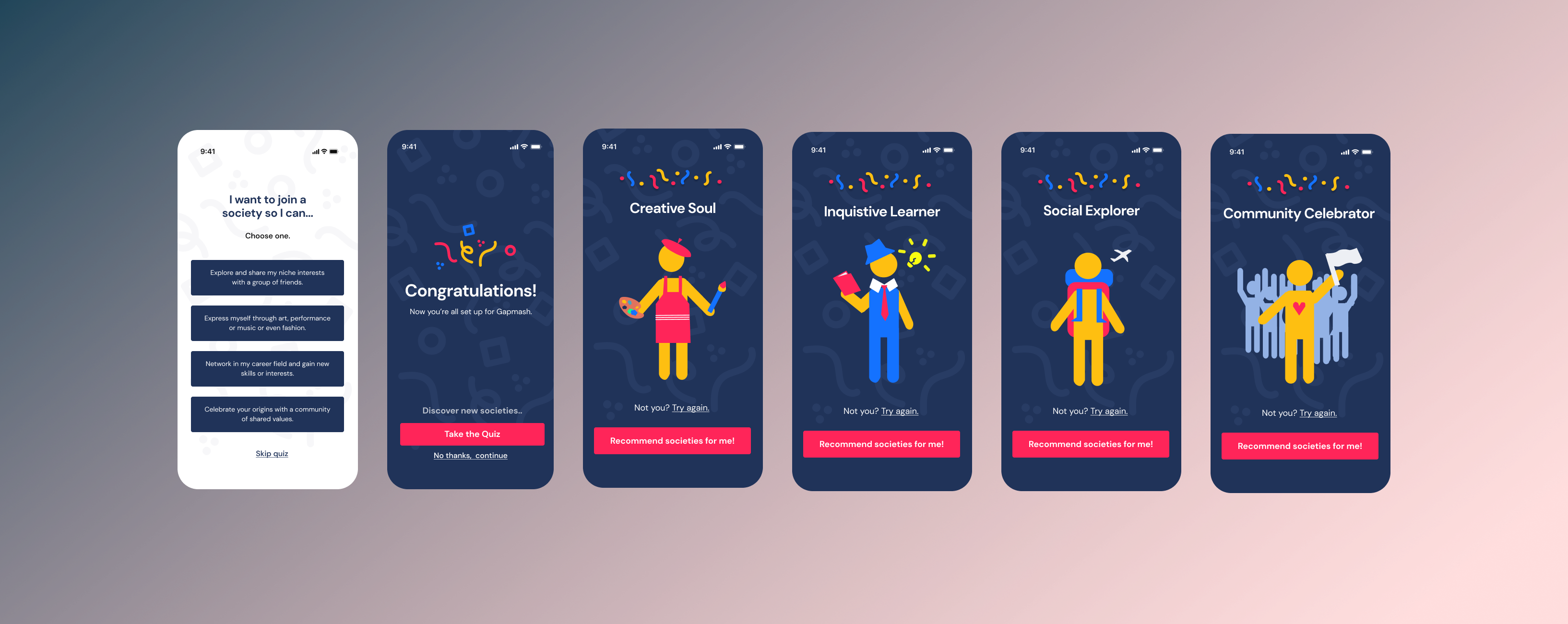
Eventually, I ended up grouping all interests into one of four ‘personas’:
1. Creative Soul
2. Social Explorer
3. Inquisitive Learner
4. Community Celebrator

SKETCHING IDEAS
I began sketching the new feature, visualizing how it would streamline the sign-up process and make event recommendations more engaging.

I also sketched out ideas for on how to best represent each kind of persona based on its associated interests and activities.


Step 4, Iterate.
Early Prototypes
I started using the existing brand assets from the Figma app to make some quick mockups of my 'persona quiz' concept and to get initial feedback from meetings.

Quiz Simplification
My initial prototype included 4 quiz questions with 3 choices each, but due to user feedback about budget and time constraints, I had to simplify it to a single, impactful question. I also added a 'Skip Quiz' button at the bottom of the screen for even faster sign-ups.


Mascot designs
After client feedback, I redesigned the persona images to be gender-neutral, making the app more inclusive and accessible for everyone. Using Figma, I made vector based mascot illustrations that matched the app's existing visual system.

Using existing brand colors and simple shapes ensured consistency and flexibility for future redesigns. Simplification also made it easy for me to add in unique costumes and accessories for each avatar based on their interests.


For example, the 'Creative Soul' wears an apron and holds a paintbrush to represent artistic hobbies, while the 'Community Celebrator' is shown with a group of people to highlight their love for social events.

Once the user gets their resulting persona, the can either click 'Not you? Try again.' or press the pink 'Recommend me societies!' button to go straight to the 'Following Page' to see their what societies the app recommends them based on related interest tags.

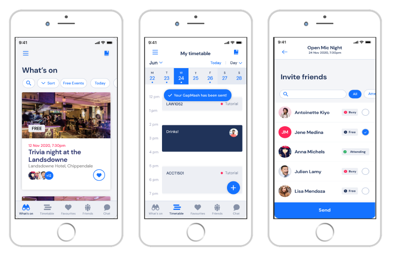
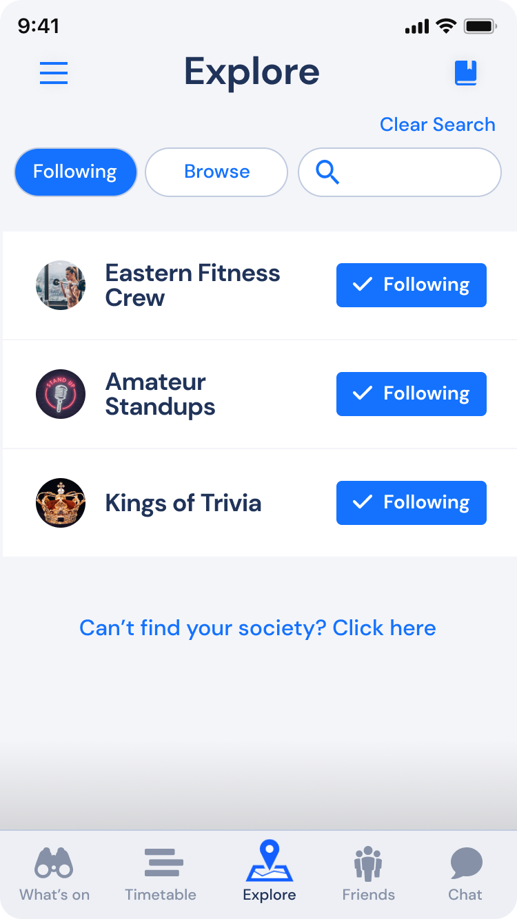
following page persona recs
After the quiz, you are taken to a 'Following Page' where you can see and select all the societies you follow, showing up on your 'My events' page. I added all persona mascots as toggle button to preview and quickly switch between different personas, enhancing flexibility, discovery and engagement for new users.


Step 5, Deliver.
Main Interface Mockups
The final mockups showcased a vibrant, user-friendly interface that made the sign-up process enjoyable and interactive.
Final Prototype
Play with a snippet of the final prototype here!
Concluding Thoughts...
Design Impact
The new quiz feature revolutionized the user experience by transforming the overwhelming list of 30+ interests into a fun, interactive selection process. Users could now easily discover events that matched their interests, making the app more engaging and reducing decision paralysis.
Lessons Learnt
In summary, this project not only honed my UX design skills but also highlighted the importance of empathy, iterative design, and user-centered thinking in creating impactful digital experiences.